Lazard Stock Tracker
Independent Work|2018 Duration: 2 days Tools: Photoshop Skills: rapid prototyping, web design, data visualization
Brief
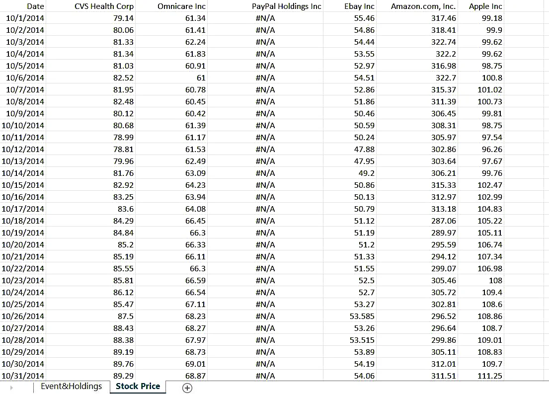
This spawns from a design challenge posed by Lazard Investment Bank. They put together a sample excel sheet
which contains information about major events for a selected group of companies along with ownership detail of 4 different funds in those companies
as well as stock price history of the companies for about two years.
Given this data set, my task is create a user-friendly html prototype to tell the users what happened to related entities.
The goal is that the user will be able to know from the prototype:
what is happening with the stock price and shareholder movement over time, how the events might influence the stock price and movement.

Research
Upon getting this task, I interviewed the manager about the following questions. The answers are listed in conjunction.

Q: who are the final users? Are they expert users (people who are familiar with terms like "M&A", "Spin-offs") or layman users (who are not familiar with these terms and need basic explanations)?
A: The final users will be bankers as well as our clients like company CEO/Board/Executive team. So yes, they are expert users and are very familiar with these terms.
Q: Are the users digitally savvy (meaning that they have a lot of experiences trying out apps/new digital gadgets/...) or not?
A: You may assume these users are good at understanding new technologies/products. However, the most important part will be describe the story from data clearly and elegantly.


Q: what is the primary device they use to interact with my design result? cellphone? tablet? laptop? or ....anything else?
A: Usually bankers will work on PC and the work may be presented to clients on big screens so PC is the priority( that’s why we ask you to develop an html page). Also it also would be great if the visualization can be printer-friendly. Since portable devices are popular now it is awesome if we can have some designs with high compatibility so people can view the result without PC. Given the tight deadline, it is a big plus but not a necessary thing.
Design Solution
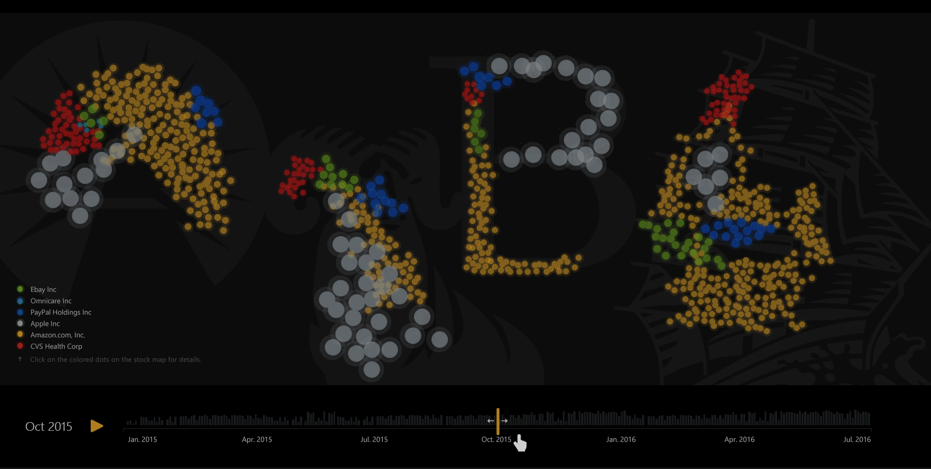
In general, my design allows users to self-direct their exploration of the data in a temporal space.
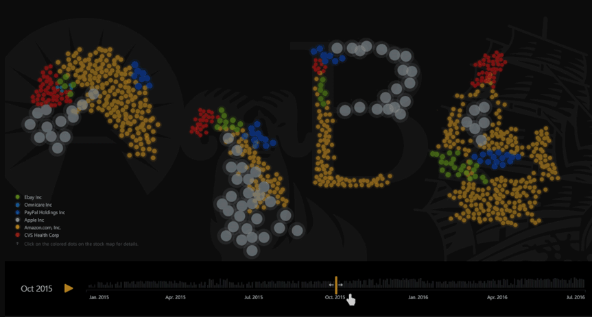
They can hit "auto-play", or manually drag the time-bar to control the time themselves.
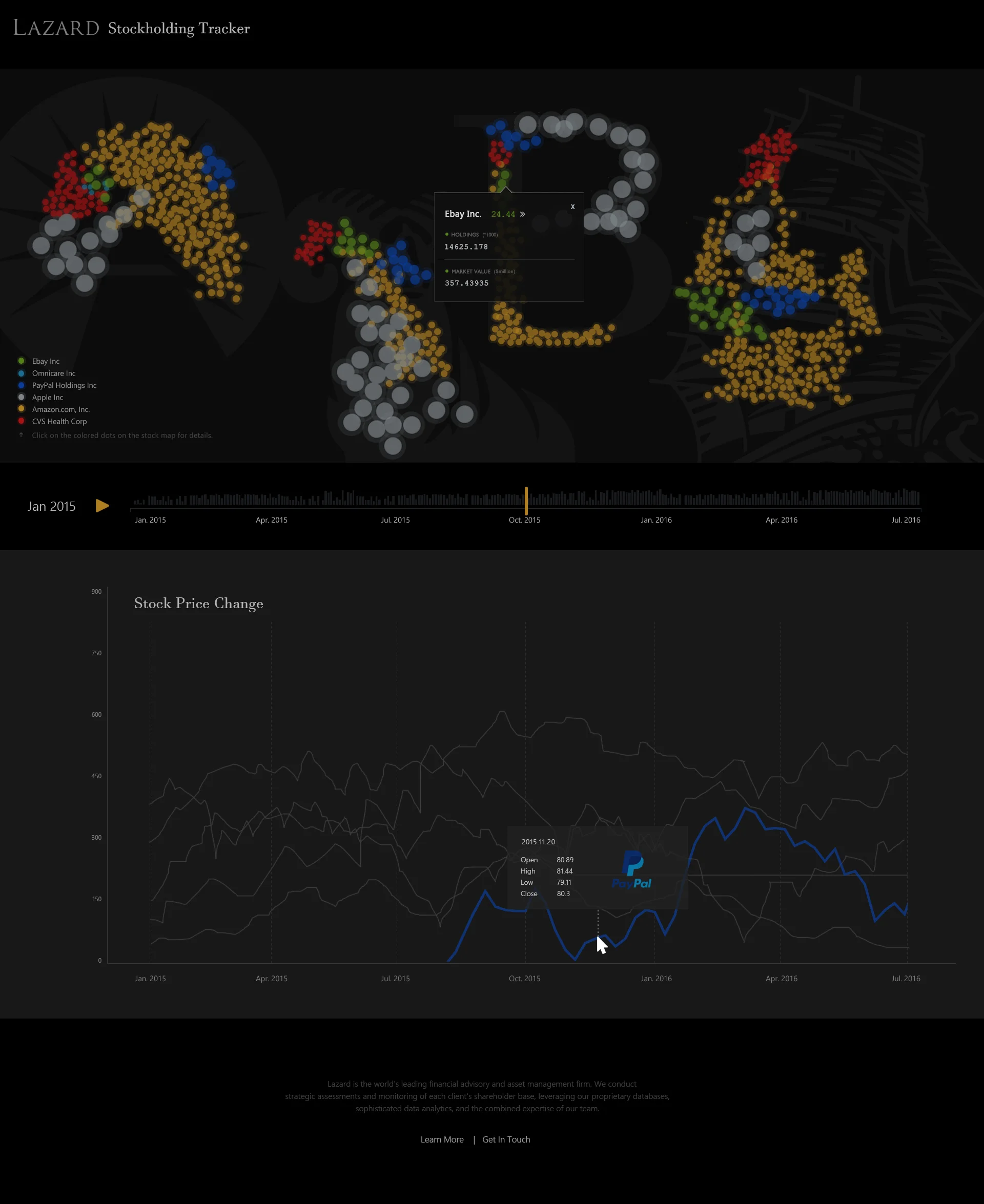
While the user drags the time-bar, the bubbles starts to change in their size (in accordance with stock price fluctuation) and number (holdings),
which gives a dynamic view of the stock price change and share holding movement over time.
Meanwhile, the user will encounter the "major events" when he/she navigates the timeline as these events will pop up in the form of an "event window",
which describes the date, entity name, and event abstract.
Since the event window pop-ups and bubble transitions happen concurrently, users will be able to establish some association between the two.
Details
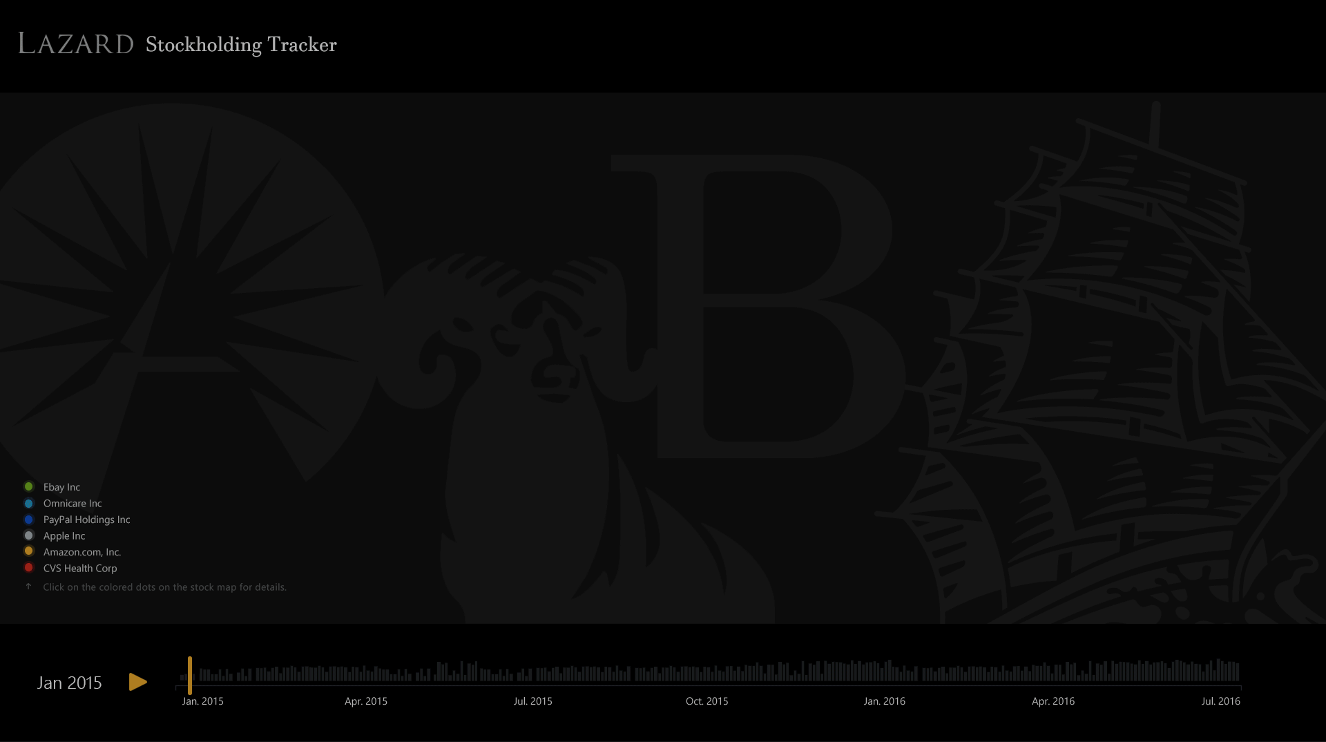
(1) The background image contains the logo of the 4 owner companies. It's a canvas on which the stock holding map will be drawn.
(2) the bubbles represents the stocks. The size of each individual bubble corresponds to the stock price (if a stock advances during a certain period, the bubble expands.
If it drops, the bubble shrinks), while the number of the bubble stands for the amount of stock holdings.
In this way, the user can grasp how much stock worth each owner company is holding at a specific time by glancing at the whole bubble area at each zone.
The color of bubbles are not arbitrary. Instead, they are derived from the stock brands themselves.
I made use of the brand heritage of Apple, Amazon, Paypal, CVS, Ebay, as well as Omnicare to save user's cognitive load.
Another advantage of this is, the user can have an intuitive sense of the proportion of different stocks within one owner company and among different owner companies.
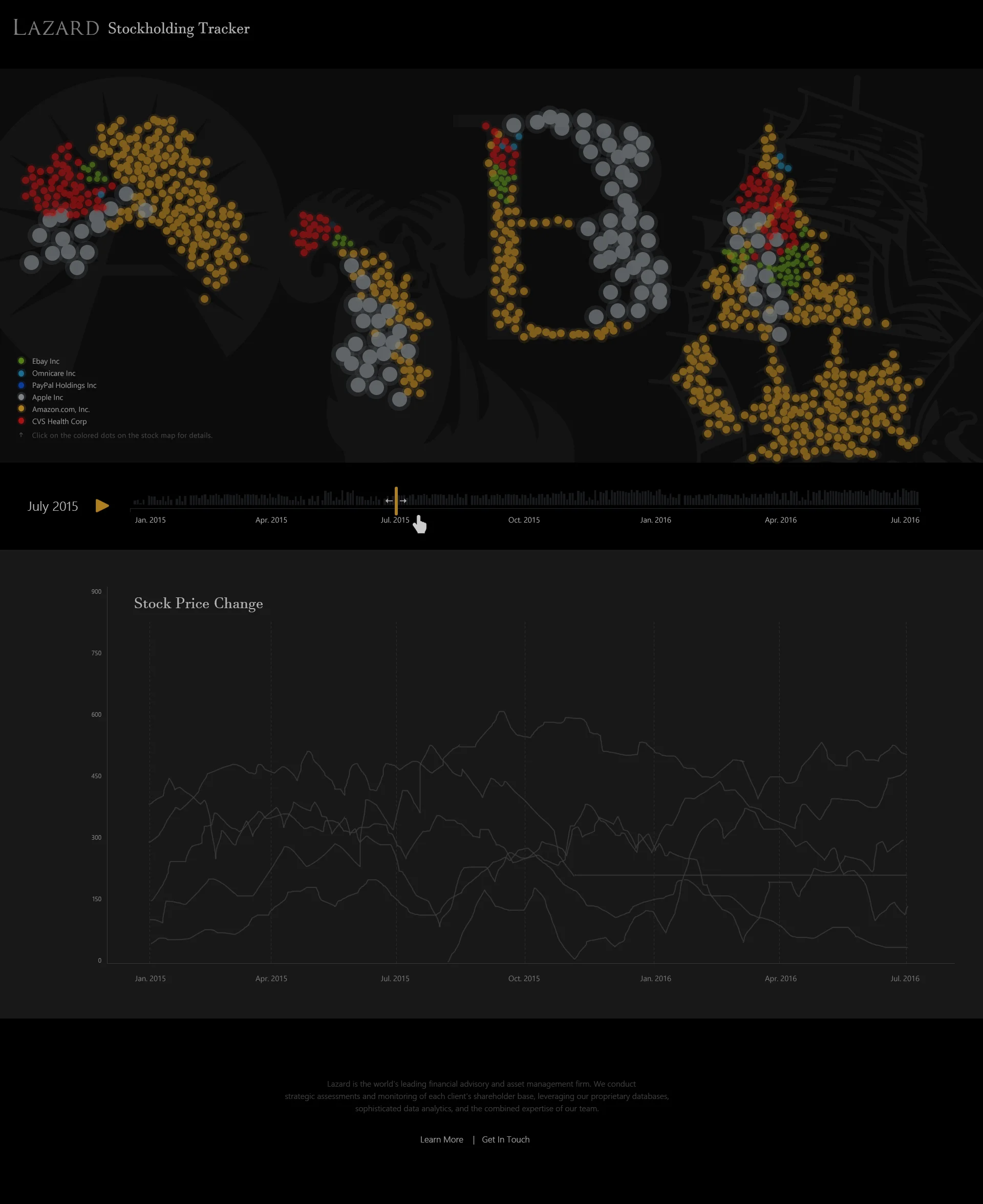
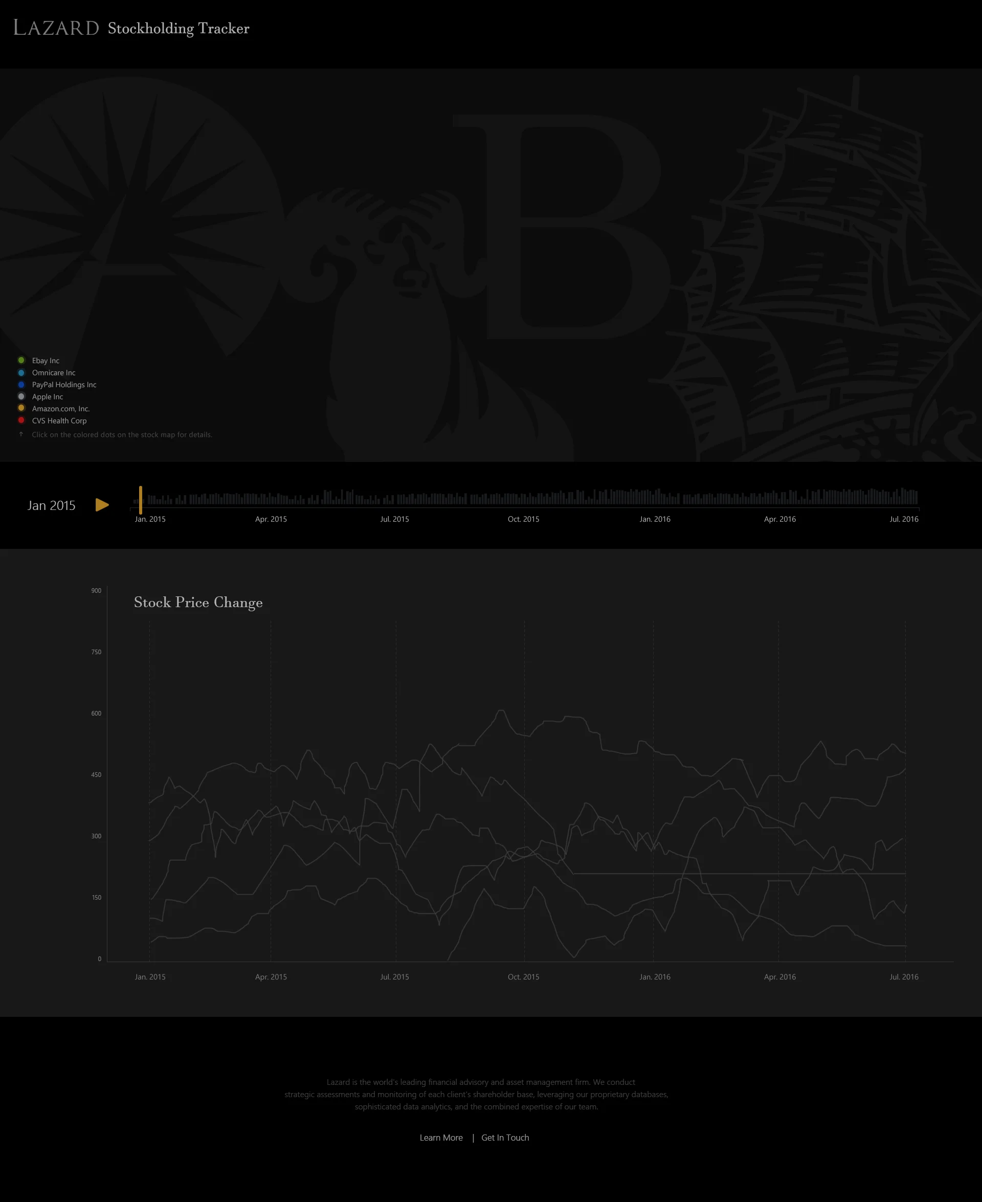
(3) The data exploration process is designed to be top-down. We don't want users to get lost in trivial details at first. But after they get a big picture, they are empowered to dive into details.
Say, the user hovers over a specific colored-bubble area, information about that stock will pop up (price, holdings by that company, market value).
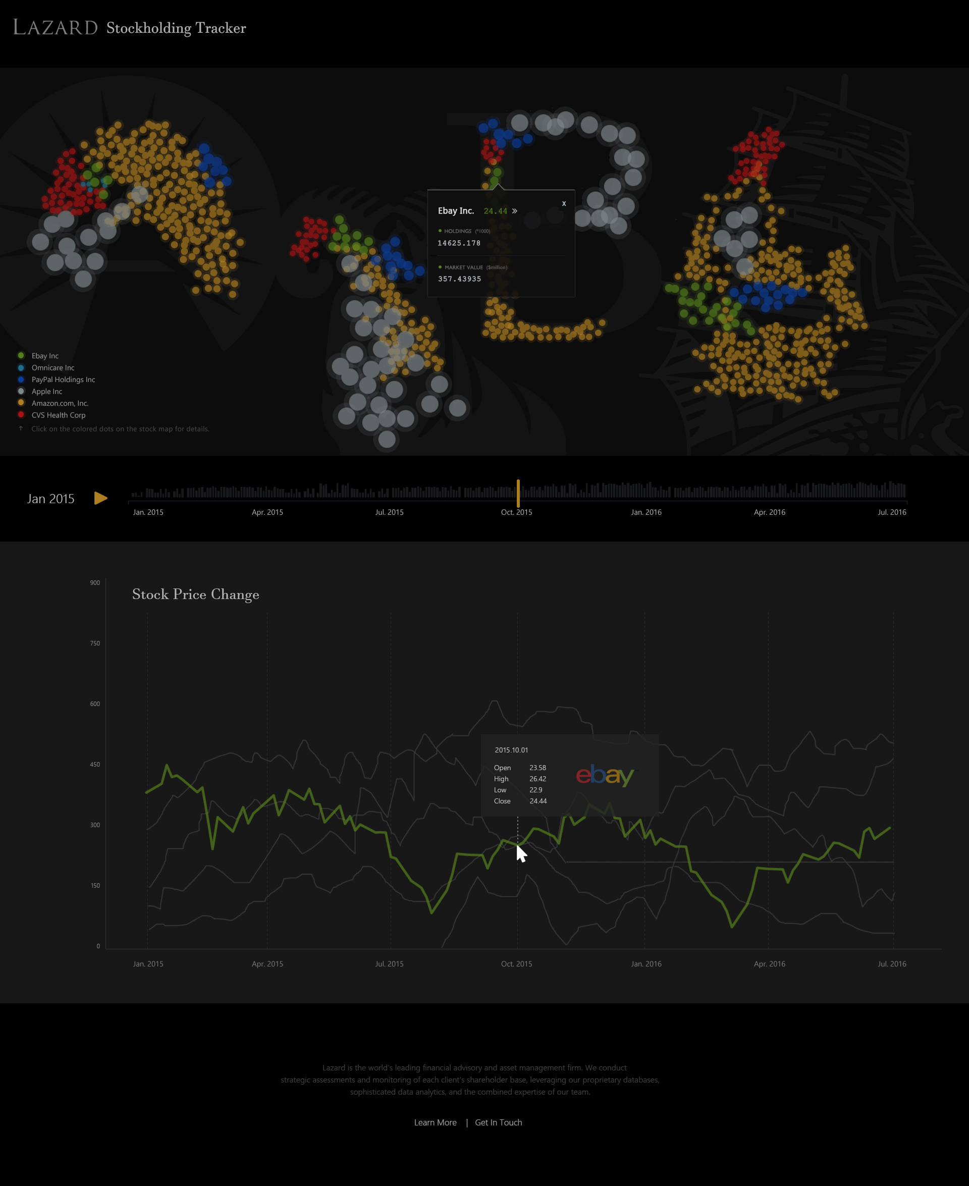
(4) Users can trace the stock price history by clicking the Right Arrow besides the stock name.
They will be directed to the bottom half of the html page, where the historical price graph of the 6 stocks are laid out simultaneously along the timeline.
Hovering over each stock's price curve will highlight that stock and allow more detailed reading of its price change over time.